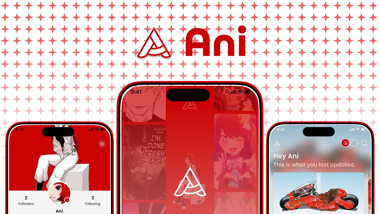
App for the Animanga community
UI/UX Brand System Motion Design - 2026
Overview
Ani is a live community platform built for anime and manga fans — a space where users can write reviews, curate personal lists, and share fan content across a shared cultural identity. The challenge wasn’t just building an app. It was building a world that felt native to the community it was made for.
As lead UI/UX designer and motion designer, I directed the full design vision alongside a team — shaping everything from the foundational UI framework to the motion language, brand system, and product reveal. The work supported a global Animanga audience across the US and Japan.
The Problem
Animanga fans are passionate, opinionated, and deeply embedded in niche culture. Existing platforms — MAL, AniList, Kitsu — were functional but clinical. They lacked personality. They didn’t feel like anime.
Ani was designed to fix that: a community hub that matched the visual energy of its audience while remaining intuitive enough for casual fans to pick up and explore.
My Role
Lead UI/UX Designer & Motion Designer — working with a cross-functional team across the full product lifecycle from concept to launch.
Responsibilities spanned:
Visual identity and brand system
UI framework design in Figma (light/dark modes, component library)
Interaction design and high-fidelity prototyping
Motion design and animation language for transitions and micro-interactions
Design handoff and developer collaboration
Beyond the core product experience, I produced the product reveal video, which reached 101K views in its first days and helped support a $50K development fundraise.
Design System
The visual system was built around the cultural DNA of anime — high contrast, expressive type, and a bold use of red that references everything from shonen action to retro manga print. Every component was designed with modularity in mind, making the system scalable as the platform grows.
Key system decisions:
Primary palette anchored in deep crimson (#C80000) against near-black — high energy, high legibility
Typography pairing display-weight grotesque with structured body type for hierarchy at every scale
Component library built in Figma with variants, auto-layout, and documented usage across both light and dark contexts
Iconography and spacing tokens defined for consistency across mobile and desktop breakpoints
Motion & Animation
Motion was treated as a core feature, not an afterthought. Ani’s animation language communicates context — where you are, where you came from, and where you’re going — without requiring users to read a single label.
This included:
Page transition choreography aligned to navigation hierarchy
Micro-interactions on ratings, list actions, and content discovery
Scroll-driven animations for content surfacing on feed and detail views
Prototype & Handoff
The Figma prototype covered primary user flows end-to-end: onboarding, content discovery, review submission, and list management. The prototype was used for both internal alignment and developer handoff, with annotated specs and a living component library maintained throughout production.
Outcome
Ani launched as a live product in 2026. The design system established during this project became the foundation for subsequent feature development, while the product reveal video reached 101K views in its first days and helped support a $50K development fundraise.
Reflection
Leading design on a community product means designing for identity as much as usability. The animanga audience has high aesthetic standards — they notice when something feels off. That pressure made every design decision more intentional, and the result is a product I’m genuinely proud to have shipped.
Website




" height="2.1187359513420594px" id="P5kIJB7Ko" transform="translate(4.268 0)" width="11.73219480873486px"/><path d="M 2.13 11.637 L 0 11.637 L 0 0 L 2.13 0 Z" fill="rgb(15, 14, 14)" height="11.636652122173734px" id="xBplekXaY" transform="translate(13.87 0)" width="2.1296344887445002px"/><path d="M 1.509 14.942 L 0 13.447 L 13.563 0 L 15.073 1.496 Z" fill="rgb(15, 14, 14)" height="14.94221869628454px" id="DEz5S9WYM" transform="translate(0 1.058)" width="15.072818848944806px"/></g></svg>)
